Histograms
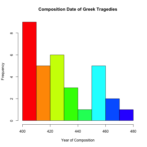
Another type of graph that can be useful when working to gain an overview of a data set is the histogram. A histogram allows you to visualize the frequency distribution of values within a data set. The hist() command is used to generate a histogram and it allows for many of the same options we were able to apply to our bar and pie charts. For example, the command you wanted to see how the tragedies in our data set are distributed over time, you can issue the command hist(trag.length[, "Year"], main="Composition Date of Greek Tragedies", xlab="Year of Composition", ylab="Frequency", col=rainbow(10)) generates the following graph. 
The R command has grouped our data into eight categories ordered by decade and then plotted the number of tragedies that were composed in that decade. The first column on the left, for example, shows that there are nine tragedies written between 409 and 400 BCE, the second column shows that there were five written between 419 and 409, etc.
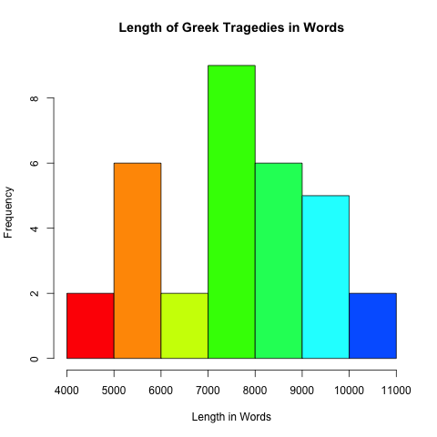
We can create a similar graph showing the distribution of various tragedy lengths with the command hist(trag.length[, "Word.Count"], main="Composition Date of Greek Tragedies", xlab="Year of Composition", ylab="Frequency", col=rainbow(10)).  This graph divides the tragedy data into one thousand word bins and allows us to see that most tragedies are between seven thousand and eight thousand words.
Histograms can sometimes be misleading because of the way they conflate data into larger bins. For example, the graph showing year of composition shows five tragedies written between 459 and 450 BCE. Examining our data, however, shows that all five of these tragedies were written between 458 and 456 BCE and, further, that a better ten year period to examine is actually 465 - 456 BCE.
| Data for Aeschylus from trag.length data frame | ||||
|---|---|---|---|---|
| Genre | Author | Play | Year | Word.Count |
| Tragedy | Aeschylus | Suppliants | 463 | 4939 |
| Tragedy | Aeschylus | Seven Against Thebes | 467 | 5115 |
| Tragedy | Aeschylus | The Persians | 472 | 5189 |
| Tragedy | Aeschylus | Eumenides | 458 | 5297 |
| Tragedy | Aeschylus | Libation Bearers | 458 | 5447 |
| Tragedy | Aeschylus | Agamemnon | 458 | 8187 |
| Tragedy | Aeschylus | Prometheus Bound | 456 | 5923 |
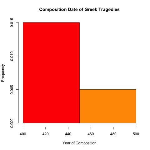
To account for this, the hist() function offers several options to adjust the default method that it uses to categorize data. Placing a single digit after the vector containing the data used to create the histogram specifies the number of bars that will appear. For example, inserting the digit 2 into the command hist(trag.length[, "Year"], 2, main="Composition Date of Greek Tragedies", xlab="Year of Composition", ylab="Frequency", col=rainbow(10)) creates a histogram with only two categories for data. 
You can also create a vector that gives exact values where you would like category breaks to appear when creating the histogram. These breaks can be any arbitrary value and they do not need to be evenly spaced. For example, create a vector with the command bins <- c(480, 470, 465, 460, 455, 450, 440, 430, 425, 420, 415, 410, 405, 400) and then generate the histogram using the command hist(trag.length[, "Year"], breaks=bins, main="Composition Date of Greek Tragedies", xlab="Year of Composition", ylab="Frequency", col=rainbow(10)) to generate the following graph. 
<<-- Previous: Averages, Range, Interquartile Measures, and Boxplots
Variation, Standard Deviations, and Z-Scores -->>